Selected Work · Brand Experience
GIVE ME
SAMBUSAK
A playful street-food brand built from identity and packaging to spatial design and a self-ordering experience — creating one recognizable system across physical and digital touchpoints.
Brand Identity
Packaging
Spatial
Digital Experience
Digital Experience

Project
Academic concept
Focus
Street-food experience
Deliverables
Identity · Packaging · Space
Digital
Self-ordering flow
02 / Challenge
MORE THAN
A FOOD STAND.
The goal was to build a complete street-food identity that could feel bold and memorable in a busy public environment.
The system needed to work across packaging, signage, point-of-sale, menus and digital ordering while staying instantly recognizable.
03 / Brand idea
LOUD.
FRIENDLY.
HUNGRY.
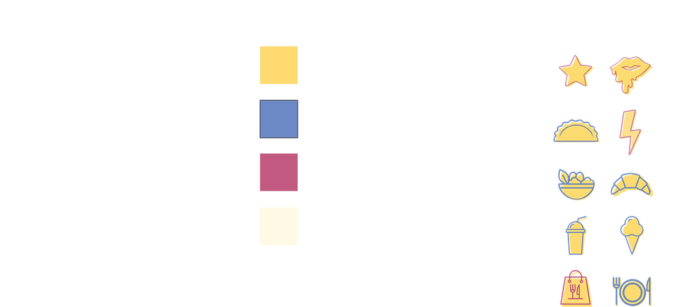
The identity mixes bold typography, playful iconography and a warm street-food palette to create a brand that feels energetic without becoming chaotic.
04 / Identity system
BUILT TO BE
SEEN FAST.
Large type, simple shapes and strong contrast help the identity remain recognizable from packaging scale to environmental graphics.
Logo

Graphic language
05 / Packaging
PACKED WITH
THE BRAND.
The packaging turns every order into a branded moment, using repeatable patterns, oversized typography and simple stickers to keep production flexible.


06 / Spatial design
THE BRAND
GETS BIG.



Signage, color and oversized graphics turn the physical stand into a recognizable landmark rather than simply another food counter.
07 / Ordering experience
FROM CRAVING
TO ORDER.
The self-ordering experience carries the same visual language into digital, keeping the interface playful while making choices clear and fast.

08 / System thinking
ONE BRAND.
EVERY SCALE.
01
Identity
A bold visual foundation that defines the tone of the entire experience.
02
Packaging
Flexible branded surfaces that keep every takeaway moment recognizable.
03
Environment
Large-scale graphics transform the physical point of sale into part of the brand.
04
Digital
The same identity carries into the self-ordering interface without compromising clarity.
09 / Outcome
A BRAND
YOU CAN
STEP INTO.
Recognizable
A strong visual identity holds together every physical and digital touchpoint.
Flexible
The system adapts easily from small packaging to large environmental graphics.
Experiential
Branding becomes part of the complete food experience rather than decoration around it.